Mobile Frontend
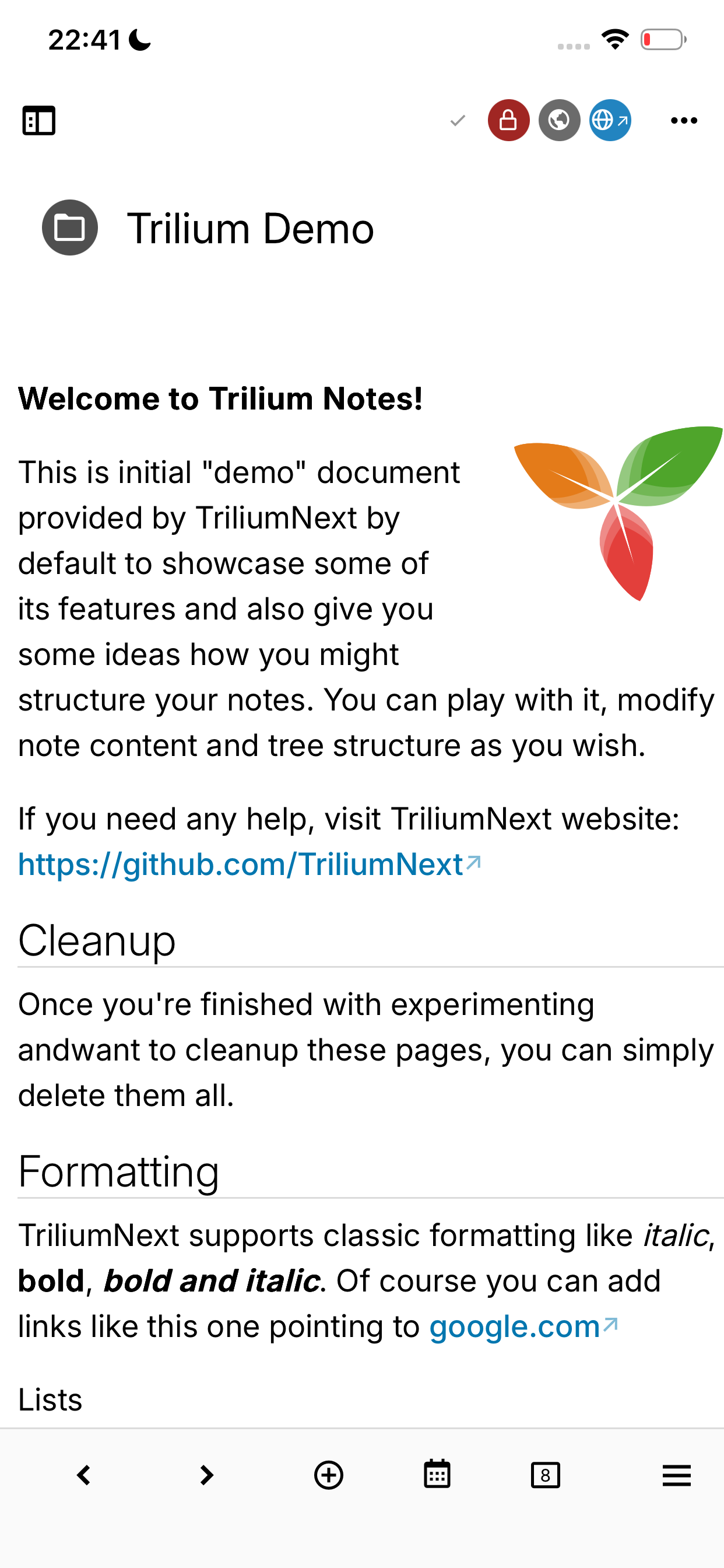
Trilium has a mobile web frontend which is optimized for touch based devices - smartphones and tablets. It is activated automatically during login process based on browser detection.
Mobile frontend is limited in features compared to the full desktop version. See below for more details on this.
Layout basics
Unlike the desktop version, the mobile version has a slightly different UI meant to better fit the constrained screens of a mobile phone.
Here is a non-exhaustive list of differences between the desktop version and the mobile one:
- On a phone, the Note Tree lies under the note. The button in the top-left of the screen slides the note away to reveal the tree, on the folder holding the note, with the note highlighted. Opening a note from the tree slides it back in.
- To return to the note without opening it again, tap its title with the icon in the top-right of the tree, whichever folder the tree is showing.
- A swipe from the left edge of the screen also reveals the tree, but the system's or the browser's back gesture can take it over, depending on the platform.
- Each tab remembers whether it was showing the tree or its note, and, for a tab left on the tree, the folder the tree was showing. Switching tabs brings both back. Once the tab shows its note again, its tree goes back to the folder holding the note.
- A new tab opens on the tree, at the root, with the Workspaces and the Bookmarks, if there are any, listed above it. Tap a workspace to hoist the tab into it.
- In the Android app, the system back gesture or button closes the menu or dialog on top first, then a settings page in Options, then slides the note away to reveal the tree, then goes up one level in the tree. At the top of the tree, it sends the app to the background.
- On wider screens, such as a tablet in landscape, the note tree is displayed as a sidebar next to the note instead. There, a button hides and shows it, and the choice is remembered together with the left pane of the desktop version.
- A note with children shows a (on iOS, preceded by how many children it lists): tapping it lists its children, and tapping any other note opens it. The note whose children are listed stands at the top, with a preview of its content; tap it, or the Open at its foot, to open it.
- Press and hold a note to display the Note tree contextual menu. Opening a note in a new tab from it keeps the tree on screen, so you can open several notes in a row.
- The Quick search bar is also displayed at the top of the note tree.
- The full Search function can be triggered either from either the Global menu or from the Launch Bar, if configured.
- The Global menu is shorter: New window and Keyboard shortcuts are left out, and Switch to desktop version is under Advanced.
- The Launch Bar is displayed at the bottom of the screen.
- The launch bar uses a different configuration for icons than the desktop version. See the dedicated page for more information on how to configure it.
- Most of the note-related actions are grouped in the horizontal dots icon on the top-right of the note.
- The Right Sidebar is replaced by the note panel, a sheet that opens from the bottom of the screen with the button to the left of those dots. Its tabs (outline, attributes, connections, AI chat and widgets) are switched from a bar at the bottom of the sheet.
- In a text note, the formatting toolbar sits at the bottom of the screen. See Editing text notes below.
- On iOS, the buttons of the title row, the launch bar, the formatting toolbar, the menus that open from the bottom of the screen and short dialogs are translucent panes that float clear of the screen's edges, and the note scrolls beneath the title row and the launch bar. A dialog taller than half the screen is opaque and attached to the bottom of the screen instead. To make the panes opaque, go to Options → Appearance → Performance and turn off Background effects for menus, popups and panels. On Android, the option is not shown and they are always opaque.
- While the on-screen keyboard is open, a button in the bottom-right corner, just above the keyboard, hides it. In a text note, the button is at the right end of the formatting toolbar. While a menu of the formatting toolbar is open in place of the keyboard, the button becomes a , which closes the menu and brings the keyboard back. This works in every note type and in every text field, and is the only way to hide the keyboard in the iOS app, where the keyboard has no Done button.
- The Tabs are grouped under a tab switcher in the Launch Bar, where the tabs are displayed in a full-screen grid with preview for easy switching, as well as additional options such as reopening closed tabs. On a phone, a tab left on the note tree shows the folder it was on, with the tab's note highlighted, instead of a preview of the note.
- Swipe left or right anywhere on the launch bar to go to the next or previous tab without opening the switcher. This works while the tab switcher is in the launch bar and all of the bar's buttons fit on the screen; when they do not, swiping scrolls the bar instead. The page follows your finger and reaches the other tab as your finger reaches the edge of the screen: let go less than a third of the way there to stay on the current tab, unless you flick. Past the first or the last tab, the page only stretches a little and springs back when you let go.
- Since v0.100.0, Split View can also be used in mobile view, but with a maximum of two panes at once. The splits are displayed vertically instead of horizontally.
Editing text notes
The formatting toolbar
In a text note, the formatting toolbar sits at the bottom of the screen as a single row that scrolls sideways. It is shown only while you are editing the text, and hides when you hide the keyboard or move to another field, such as the note title. From left to right, it holds:
- Undo and Redo, since the on-screen keyboard has no keys for them.
- A highlighted button naming the element the cursor is in, such as Table › or List ›, when it is in one. See Tables, images and other elements and Lists below.
- The block type button, to insert content, and for the formatting applied to text.
- to add a link and to attach a file.
- The indentation buttons, then and , which move the current block, or the selected blocks, up or down, as Alt+↑ and Alt+↓ do on a keyboard. Inside a table they move the row instead.
- The AI assistant button, shown once a provider is configured, which opens its quick actions as a menu at the bottom of the screen, with Ask AI… at its top.
While the keyboard is open, the button at the right end of the toolbar hides it.
The hints in the corner of the editor that explain the element under the cursor, such as a to-do item's state and its shortcut, are not shown, whatever the Content hints setting under Options → Text Notes → Features.
Inserting content
The button opens insertions as tiles at the bottom of the screen:
- Image, table and to-do list.
- Code block, block quote and admonition.
- The less common collapsible, tabs, columns, horizontal line, page break, footnote, math, drawing canvas, Mermaid diagram, bookmark, link and content embeds, special characters, emoji, icon, date/time, template and Markdown import.
The image is also under the paperclip, and the to-do list, code block, block quote and admonition are also in the block type button.
The tiles marked with open a list of choices:
- Code block: the language.
- Admonition: its type.
- Insert table: the size of the table.
- Columns: the number of columns.
- Footnote: a new footnote or a reference to an existing one.
- Date/time: the format of the date and time.
- Insert text snippet: the template to insert. It is grayed out while there are none.
Block types
The block type button opens the block types as tiles at the bottom of the screen, with the current one highlighted:
- Paragraph and heading 2 to 6.
- Bulleted list, numbered list and to-do list.
- Code block, block quote and admonition.
Picking a paragraph or a heading in a list turns the item back into plain text, and the same goes for a code block. Block quote and admonition wrap the current block rather than replace it, so they are highlighted alongside it; pick one again to remove it.
Typing - , 1. or [ ] at the start of a line also starts a list.
Lists
While the cursor is in a list, a List › button follows Undo and Redo. Its row holds:
- The indentation buttons and the buttons that move the item up or down, as on the main row.
- List type, which opens the to-do list and the markers of bulleted and numbered lists (such as squares or roman numerals) as tiles, the markers under the kind of each, with the current one highlighted. Picking a tile of another kind also turns the list into that kind, such as a bulleted list into a numbered one or a to-do list back into a bulleted one.
- In a numbered list, Start at, which asks for the number the list starts at, and Reversed order, which is highlighted while the list counts down.
- In a to-do list, a button for each task state, followed by to edit the states.
Starting a list, from the block type button, the insert menu or by typing - , 1. or [ ], shows this row right away. It stays closed once you tap the back button, until you start another list.
Tables, images and other elements
While the cursor is in a table, an image, a code block, a link or another element that has a toolbar of its own on desktop, a highlighted button naming that element, such as Table ›, follows Undo and Redo. It replaces the formatting toolbar with the element's toolbar, which starts with a back button that closes it again, followed by the element's name ahead of its tools. The button goes away when the cursor leaves the element.
Selecting an element as a whole, such as an image, or tapping a link shows its toolbar right away; tap the back button to return to the formatting toolbar.
Buttons of the element's toolbar with a list of choices, such as the column and row actions of a table, open that list as a menu at the bottom of the screen, where an option that is on or off, such as a table's header row, is a switch.
Formatting text
The formatting applied to text (bold, italic, underline, strikethrough, inline code, superscript and subscript, keyboard shortcut, font size and colors, and removing formatting) is on a row of its own, followed by the left, center, right and justify alignments of the current block, with the current one highlighted. The row ends with to cut the selection into a sub-note.
- Tap after the button to show it, and at its start to return to the main row.
- Selecting text shows this row on its own, and it goes back to the main row once the selection is gone (for example as you start typing), unless you opened or closed the row yourself in the meantime.
The font size button opens the list of sizes as a menu at the bottom of the screen, each drawn at its size, with the current one checked.
A single color button replaces the separate text and background color buttons. It opens a menu with a row of colors for the text and one for its background, each with a cell that removes the color and one that opens the device's color picker.
Links and attachments
The link button replaces the separate link and internal link buttons. It opens the Add link dialog, which links to a note or to a web address, or Edit link when the cursor is inside a link. The dialog does not open the keyboard by itself; tap the note or address field to type. The same button is on the row of text formatting, after the inline styles, to turn selected text into a link.
The button opens Image, Camera, Attach and embed file and Attach file as a link as a list: the menu of the desktop toolbar, with Camera added. Camera opens the device's camera and inserts the photo taken; the others open the device's file picker.
Installing as a PWA
The mobile view can be set up as a PWA. While this does not offer any offline capabilities, it will display the application in full-screen and makes it easy to access via your mobile phone's home screen.
iOS with Safari
- Open your default web browser and access your Trilium instance.
- Login.
- Press the […] button in the bottom-right of the screen and select Share.
- Scroll down to reveal the full list of items and choose Add to Home Screen.
- Press Add and the web app will be available.
Android with Google Chrome
- Open your default web browser and access your Trilium instance.
- Login.
- Press the three vertical dots icon in the top-right of the screen and select Add to Home screen.
- Select the Install option.
- Select an appropriate name.
- The web app will appear as an application, not on the home screen.
Android with Brave
- Open your default web browser and access your Trilium instance.
- Login.
- Press the three vertical dots icon in the bottom-right of the screen and select Add to Home screen.
- Press the Install option.
- The web app will appear as an application, not on the home screen.
Samsung Browser
- Open your default web browser and access your Trilium instance.
- Login.
- Press the hamburger menu in the bottom-right of the screen.
- Select Add to, followed by Home screen.
- Press Add and the web app will appear on the home page.
Sharing to Trilium
Once installed as a PWA on Android, Trilium appears in the system's share menu, so links, text, images and other files can be sent to it from other apps. Shared content is saved to the Note Inbox, and Trilium opens the note it created:
- Text or a link becomes a text note. A shared link is also stored in the
#pageUrllabel. - A single file becomes an image note or a file note, placed directly in the inbox.
- Several files, or files shared together with text, are placed under a new text note that holds the text.
Every note created this way carries the #clipType=share label, which gives a shared text note the icon unless the note has an #iconClass of its own. A single share can carry at most 20 files.
Testing via the desktop application
If you are running Trilium without a dedicated server installation, you can still test the mobile application using the desktop application. For more information, see Using the desktop application as a server. To access it go to http://<ip>:37840/login?mobile .
Forcing mobile/desktop frontend
Trilium decides automatically whether to use mobile or desktop front-end. If this is not appropriate, you can use ?mobile or ?desktop query param on login page (Note: you might need to log out).
Alternatively, simply select Switch to mobile version in the Global menu. In the mobile version, select Advanced → Switch to desktop version there instead.
Scripting
You can alter the behavior with Scripting, just like for normal frontend. For script notes to be executed, they need to have labeled #run=mobileStartup.
Custom Launch Bar widgets are also supported. Right pane widgets are shown in the Widgets tab of the note panel.