 User Guide
Built-in components
Trilium comes with its own set of Preact components, some of which are also available to Custom Widgets and Render Note.
To use these components, simply import them from trilium:preact:
import { ActionButton, Button, LinkButton } from "trilium:preact";and then use them:
export default function MyRenderNote() {
const onClick = () => showMessage("A button was pressed");
return (
<>
<h2>Buttons</h2>
<div style={{ display: "flex", gap: "1em", alignItems: "center" }}>
<ActionButton icon="bx bx-rocket" text="Action button" onClick={onClick} />
<Button icon="bx bx-rocket" text="Simple button" onClick={onClick} />
<LinkButton text="Link button" onClick={onClick} />
</div>
</>
)
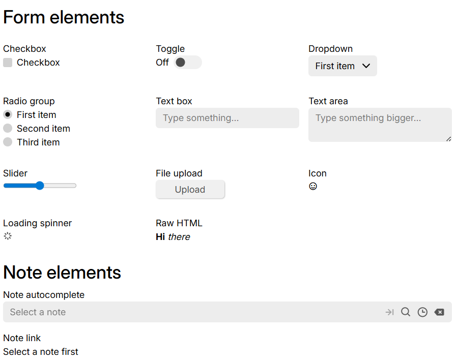
}Widget showcase#
This is a Render Note example with JSX that shows most of the built-in components that are accessible to custom widgets and JSX render notes.
To use it, simply:
- Create a render note.
- Create a child code note of JSX type with the content of this file: Widget showcase
- Set the
~renderNoterelation of the parent note to the child note. - Refresh the render note to see the results.