 User Guide
New Layout
The New layout is a series of UI/UX changes that were introduced in v0.101.0 that heavily change both existing UI elements, as well as adding some new ones. The goal of this new layout is to modernize the application and to make it more intuitive but at the same time to reduce clutter.
Newly introduced features#
Status bar#
At the bottom of the window there is a new bar called the Status bar. This bar houses multiple items such as the Breadcrumb navigation and information and settings about the current note, such as the content language and Attributes.
For more information, consult the dedicated page.

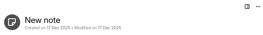
Inline title#
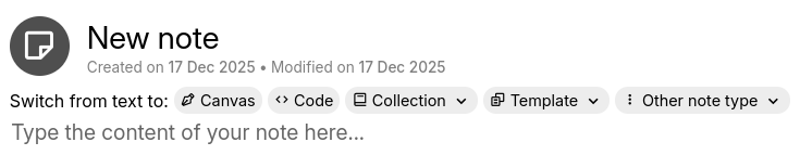
In previous versions of Trilium, the title bar was fixed at all times. In the new layout, there is both a fixed title bar and one that scrolls with the text. The newly introduced title is called the Inline title and it displays the title in a larger font, while also displaying additional information such as the creation and the modification date.
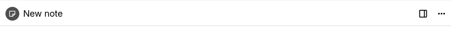
Whenever the title is scrolled past, the fixed title is shown instead.
This only affects Text and Code notes. Note types that take the entirety of the screen such as Canvas will always have only the fixed title bar.
Depending on the note type, the inline title will also present some more interactive options such as being able to switch the note type (see below).
New note type switcher#
When a new Text or Code note is created, a note type switcher will appear below the Inline title. Apart from changing the note type, it's also possible to apply a template.
The switcher will disappear as soon as a text is entered.
Note badges#
Note badges appear near the fixed note title and indicate important information about the note such as whether it is read-only. Some of the badges are also interactive.

The following badges are available:
- Read-only badge, which will be shown if the note is not editable due to either automatic read-only or manual read-only. Clicking on the badge will temporarily edit the note (similar to the Edit floating button).
- Share badge, which will indicate that the current note is shared. The badge will also indicate if the share is on the local network (for the desktop application without Synchronization set up) or publicly accessible (for the server).
- Web clip badge, which will indicate if the note was clipped using the Web Clipper. The badge acts as a link, so it can be clicked on to navigate to the page or right clicked for more options.
- Execute badge, for scripts or saved SQL queries which have an execute button or a description.
Some of these badges replace the dedicated panels at the top of the note.
Collapsible sections#
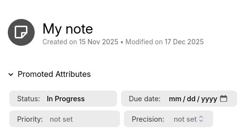
The following sections have been made collapsible:
- Promoted Attributes
- For full-height notes such as Canvas, the promoted attributes are collapsed by default to make room.
- The keyboard shortcut previously used to trigger the promoted attributes ribbon tab (which was no longer working) has been repurposed to toggle the promoted attributes instead.
- Edited Notes, which appears for Day Notes is now shown underneath the title.
- Whether the section is collapsed or not depends on the choice in Options → Appearance.
- Search Properties, which appears for the full Search and Saved Search.
Changing to the existing layout#
Removal of the ribbon#
The most significant change is the removal of the ribbon. All the actions and options from the ribbon were integrated in other places in the application.
Here's how all the different tabs that were once part of the ribbon are now available in the new layout:
- “Formatting toolbar” was relocated to the top of the page.
- Instead of having one per split, now there is a single formatting toolbar per tab. This allows more space for the toolbar items.
- “Owned attributes” and “Inherited attributes” were merged and moved to the status bar region (displayed one above the other).
- “Basic Properties” were integrated in the Note buttons menu.
- The only exception here is the Language combo box which can now be found in the status bar (top-right of the screen).
- “File” and “Image” tabs
- The buttons were moved to the right of the note title, as dedicated entries in Note buttons.
- The info section has been merged into the Note info section of the status bar.
- Edited notes
- Moved underneath the title, displayed under a collapsible area and the notes are represented as badges/chips.
- Whether the section is expanded or collapsed depends on the “Edited Notes ribbon tab will automatically open on day notes” setting from Options → Appearance.
- Search definition tab
- Moved underneath the title under a collapsible area.
- Expanded by default for new searches, collapsed for saved searches.
- The Note map is now available in the Note actions menu.
- Instead of opening into a panel in the ribbon, the note map now opens in a side split (similar to the in-app help).
- “Note info” tab was moved to a small (i) icon in the status bar.
- “Similar notes” tab
- Moved to the status bar, by going to the “Note info” section and pressing the button to show similar notes.
- Displayed as a fixed panel, similar to the attributes.
- The Collection properties tab were relocated under the note title and grouped into:
- A combo box to quickly switch between views.
- Individual settings for the current view in a submenu.
- Some smaller ribbon tabs were converted to badges that appear near the note title in the breadcrumb section:
- Original URL indicator for clipped web pages (
#pageUrl). - SQL and script execute buttons.
- Original URL indicator for clipped web pages (
Removal of the floating buttons#
Most of the buttons were relocated to the right of the note title, in the Note buttons area, with the exception of:
- The Edit button is displayed near the note title, as a badge.
- Backlinks is displayed in the status bar. When clicked, the same list of backlinks is displayed.
- Relation map zoom buttons are now part of the relation map itself.
- Export image to PNG/SVG are now in the Note actions menu, in the Export as image option.
How to toggle the new layout#
Starting with v0.101.0, this new layout is enabled by default. It is possible to fall back to the old layout by going to Options → Appearance and selecting Old layout.